
當寬度不同的時候保持置中排版
使用 Layout 的好處
接著上一篇在 Vue 專案使用 Slot 進行 Layout的內容,我們先加上一個置中對照組
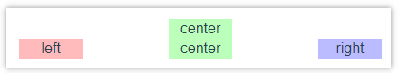
當物件的寬度相同的時候,中間的元件保持置中
接著我們增加把右邊的寬度增加一倍
<template>
  <div class="outside-box">
    <div class="box">
      <div class="item center normal-wide">center</div>
    </div>
    <Layout>
      <template v-slot:left>
        <div class="item left normal-wide">left</div>
      </template>
      <template v-slot:center>
        <div class="item center normal-wide">center</div>
      </template>
      <template v-slot:right>
        <div class="item right more-wide">right</div>
      </template>
    </Layout>
  </div>
</template>
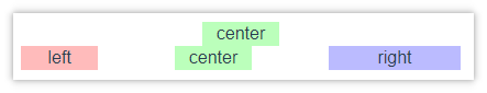
可以發現中間元件的位置,不再是原本正中間的位置, 而是保持兩邊相同的空白距離的中間
修改 Layout 元件
這個問題我們可以修改原本的 Layout 元件
Layout.vue
<template>
  <div class="layout-box">
    <div class="inner-wrapper left">
      <slot name="left"></slot>
    </div>
    <div class="inner-wrapper center">
      <slot name="center"></slot>
    </div>
    <div class="inner-wrapper right">
      <slot name="right"></slot>
    </div>
  </div>
</template>
.layout-box {
  display: flex;
  justify-content: space-between;
}
.inner-wrapper {
  display: flex;
  flex: 1;
  justify-content: center;
}
.left {
  margin-right: auto;
}
.right {
  margin-left: auto;
}
回頭看執行的結果,即使其它元件的寬度不同,也不影響中間元件置中了
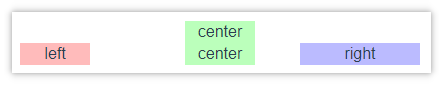
再次驗證使用 Slot 的好處,就是將排版相關的程式碼與內容分離, 修改 Layout.vue 的時候,不需要修改使用的程式,即可正確呈現想要的結果。
參考資料
html - Keep the middle item centered when side items have different widths - Stack Overflow
In CSS Flexbox, why are there no “justify-items” and “justify-self” properties? - Stack Overflow
留言